

Mastering Responsive Layouts with Tailwind CSS Grid
Discover how to effortlessly create responsive and flexible grid layouts using Tailwind CSS utilities, enhancing your web design workflow.
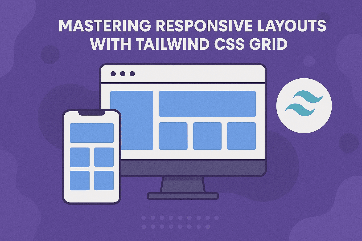
As web developers, creating responsive layouts is one of the most important skills to master. Modern websites need to work seamlessly across phones, tablets, laptops, and large desktop screens.
Gone are the days of writing dozens of custom media queries for every breakpoint. With Tailwind CSS, building responsive layouts becomes significantly faster and more intuitive.
One of the most powerful tools Tailwind provides is its support for CSS Grid. By combining utility classes with responsive modifiers, you can create flexible layouts with minimal effort.
Let's explore how it works.
Understanding CSS Grid in Tailwind
To create a grid layout, start by applying the grid utility to a container element.
Then define the number of columns using the grid-cols-{n} utility.
<div className="grid grid-cols-3 gap-4">
  <div className="rounded bg-blue-200 p-4">Item 1</div>

  <div className="rounded bg-blue-200 p-4">Item 2</div>

  <div className="rounded bg-blue-200 p-4">Item 3</div>

  <div className="rounded bg-blue-200 p-4">Item 4</div>
</div>
In this example:
gridenables CSS Grid.grid-cols-3creates three equal-width columns.gap-4adds consistent spacing between grid items.
The result is a clean and organized layout with minimal code.
Building Responsive Grids
Responsive design is where Tailwind Grid truly shines.
Using responsive prefixes, you can define different column counts for different screen sizes.
<div className="grid grid-cols-1 sm:grid-cols-2 lg:grid-cols-4 gap-4">
  <div className="rounded bg-green-200 p-4">Item 1</div>

  <div className="rounded bg-green-200 p-4">Item 2</div>

  <div className="rounded bg-green-200 p-4">Item 3</div>

  <div className="rounded bg-green-200 p-4">Item 4</div>
</div>
Here's how the layout behaves:
- Mobile devices → 1 column
- Small screens (
sm) → 2 columns - Large screens (
lg) → 4 columns
This mobile-first approach ensures your layout remains usable and visually appealing across all devices.
Understanding Tailwind Breakpoints
Tailwind provides several built-in breakpoints:
| Prefix | Minimum Width |
| ------ | ------------- |
| sm | 640px |
| md | 768px |
| lg | 1024px |
| xl | 1280px |
| 2xl | 1536px |
You can combine these breakpoints with nearly every utility class, making responsive design extremely flexible.
For example:
<div className="grid grid-cols-1 md:grid-cols-2 xl:grid-cols-5">...</div>This layout adapts automatically as the viewport grows.
Spanning Multiple Columns
Sometimes a grid item needs to occupy more than one column.
Tailwind provides the col-span-{n} utility for this purpose.
<div className="grid grid-cols-3 gap-4">
  <div className="col-span-2 rounded bg-purple-200 p-4">
    Item 1 (Spans 2 Columns)
  </div>

  <div className="rounded bg-purple-200 p-4">Item 2</div>

  <div className="rounded bg-purple-200 p-4">Item 3</div>

  <div className="rounded bg-purple-200 p-4">Item 4</div>
</div>
The first item occupies two columns while the remaining items automatically fill the available space.
This technique is particularly useful for:
- Hero sections
- Featured cards
- Dashboard widgets
- Content layouts
Creating a Responsive Card Grid
One of the most common use cases for CSS Grid is displaying cards.
Here's a practical example:
export default function CardGrid() {
  return (
    <div className="grid grid-cols-1 gap-6 md:grid-cols-2 lg:grid-cols-3">
      <div className="rounded-xl border p-6">
        <h3 className="mb-2 text-lg font-semibold">Card One</h3>

        <p>This is the content for the first card.</p>
      </div>

      <div className="rounded-xl border p-6">
        <h3 className="mb-2 text-lg font-semibold">Card Two</h3>

        <p>
          This card demonstrates how content adapts within a responsive grid.
        </p>
      </div>

      <div className="rounded-xl border p-6">
        <h3 className="mb-2 text-lg font-semibold">Card Three</h3>

        <p>
          Add as many cards as you need and the layout will adjust
          automatically.
        </p>
      </div>
    </div>
  );
}
This pattern is commonly used in:
- SaaS dashboards
- Blog listings
- Product showcases
- Portfolio websites
- Documentation sites
Auto-Fitting Responsive Columns
For even more flexibility, Tailwind allows arbitrary values.
You can create layouts that automatically fit as many columns as possible.
<div className="grid grid-cols-[repeat(auto-fit,minmax(250px,1fr))] gap-6">
  ...
</div>
This creates columns that:
- Never shrink below 250px.
- Automatically expand when space is available.
- Wrap onto new rows when necessary.
This pattern is excellent for responsive card layouts where the number of columns shouldn't be fixed.
Controlling Rows
Tailwind also provides utilities for row layouts.
<div className="grid grid-rows-3 gap-4">
  <div>Row 1</div>
  <div>Row 2</div>
  <div>Row 3</div>
</div>
You can also span rows:
<div className="row-span-2">Featured Content</div>While less common than column spanning, row utilities can be useful for advanced dashboard layouts.
Common Grid Patterns
Here are a few layouts you'll build frequently:
Two-Column Layout
<div className="grid grid-cols-1 lg:grid-cols-2 gap-8">
  <main>Main Content</main>
  <aside>Sidebar</aside>
</div>
Three-Column Feature Section
<div className="grid grid-cols-1 md:grid-cols-3 gap-6">...</div>Dashboard Layout
<div className="grid grid-cols-12 gap-6">
  <aside className="col-span-3">Sidebar</aside>

  <main className="col-span-9">Content</main>
</div>
These patterns form the foundation of many modern web applications.
Best Practices
When using Tailwind Grid, keep these principles in mind:
- Start with a mobile-first layout.
- Use consistent spacing with
gap-*utilities. - Avoid overly complex grid structures.
- Use column spanning sparingly.
- Test layouts across multiple screen sizes.
- Prefer CSS Grid for two-dimensional layouts and Flexbox for one-dimensional layouts.
Following these guidelines will help keep your layouts maintainable and scalable.
Conclusion
Tailwind CSS Grid utilities make responsive layouts dramatically easier to build and maintain.
By combining utilities such as grid-cols-*, responsive breakpoints, and column spanning classes, you can create powerful layouts directly within your markup without writing custom CSS.
Whether you're building a blog, portfolio, SaaS dashboard, or e-commerce site, mastering Tailwind Grid will help you create flexible and responsive interfaces faster than ever.
The best way to learn is through experimentation, so start building a few layouts and see just how much you can accomplish with a handful of utility classes.